Special thanks to C.J. Adams (lead for attack map, unfiltered news) and Alison Cichowlas (lead for music timeline).
| Home - | Research - | Artwork - | About Me |
Live Visualizations at Google
|
|
A theme of my work at Google is to make rich data sets accessible by visualization. Three main examples, which display live, constantly updating data:
All projects on this page were broad collaborations. My group worked
with multiple teams at Google, including Jigsaw and Play Music.
External partners include Arbor (attack map) as well
as Periscopic and
Instrument (unfiltered news).
Special thanks to C.J. Adams (lead for attack map, unfiltered news) and Alison Cichowlas (lead for music timeline).
|
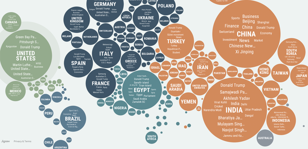 We all live in regional news bubbles, divided by both language and subject matter. The headlines in the U.S. are often radically different than the ones in, say, Brazil. The Unfiltered.News project (image above) is a way to visualize these bubbles directly, and—more important—help viewers break out of them. Based on Google News data and state-of-the-art translation technology, the site identifies and displays which subjects are disproportionately covered in the news in each country. Users can explore the relative coverage of any particular subject across the globe. They also can see a view that emphasizes exactly the news that is not being published widely in their own country. Read more here.
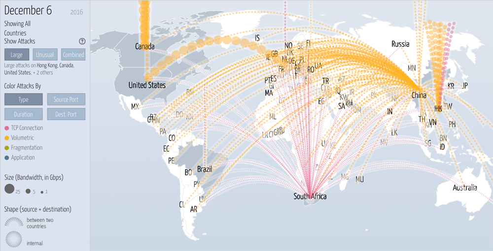
Such attacks are frighteningly pervasive, and reflect motives ranging from corporate blackmail to state assaults on the media.
Our site provides a window into this underworld, letting users see historical trends, drill down into particular attacks,
and correlate threats with news events.
|